

Page Bound
Pagebound is a social reading site and app that lets users interact with each other, focused specially on millennials. Due to the vast majority of users being centered on the app, the redesign focuses on a mobile-first approach.
The problem
The structure and navigation it’s not very user friendly, the interaction between users is confusing and not easy to initiate and the overall image it’s not cohesive.
The goal
Improve the interface making the navigation more intuitive, facilitate the communication between users and build a more cohesive image across the different pages.
My role
Lead UX designer and Graphic designer.
User research
The research conducted was mainly via online questionnaires but some users were interviewed via chat and via video call. The first assumptions were that users wanted to focus on reading books and tracking their reads and trends while occasionally commenting on other people’s comments or reviews.
After the interviews we discovered that users focused more on the social aspects, wanting to debate, have online book clubs and chat with other readers, and not so much on reading tracking or book discoveries.
Pain points
User interface issues
Users find it hard to navigate and discover all the functions of the website and app due to the unintuitive interface.
Time constraints
Busy readers find it hard to connect with other users because of the constant storm of new books to read and their inability to do so because of their busy schedule.
Community engagement
People with similar tastes have no way of connecting outside the app or directly chat. It’s all restricted to the comments sections of books, visible to all.
Lack of personalisation
Users find it hard to find book recommendations to similar books they read and only see trendy books or grouped by categories.
User personas
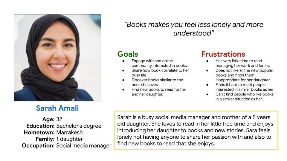
Persona: Sarah Amali
Problem statement:
Sarah is a busy social media manager and mum who needs to find new books to read with her daughter because all the new popular books are not kids friendly.
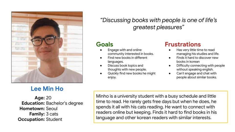
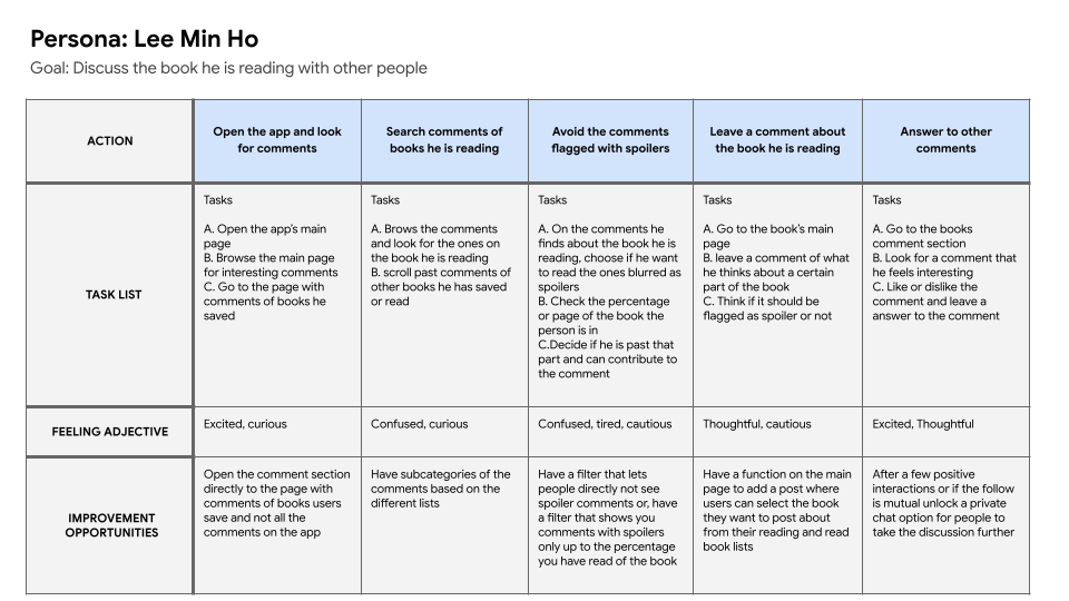
Persona: Lee Min Ho
Problem statement:
MinHo is a busy korean singer who needs to find an online community without revealing his identity because he loves discussing books with people and creating connection but doesn’t want people to recognise him.
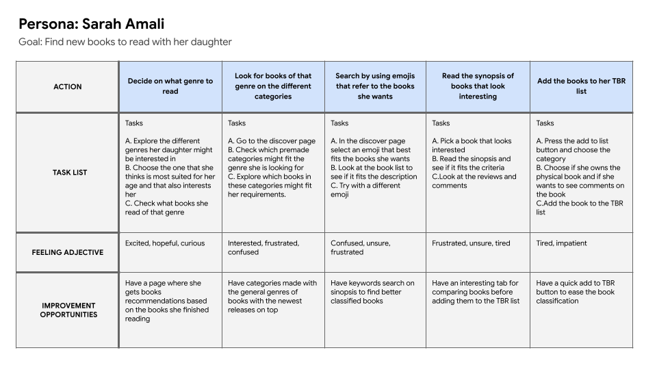
User journey map
In this user journey map the focus was to find all the challenges Sarah faced when trying to find new books to read, this highlighted the lack of filtering or categorizing of the app.
This user journey map focuses on the interaction between users, highlighting the difficulties faced when trying to have an interaction beyond a comment.
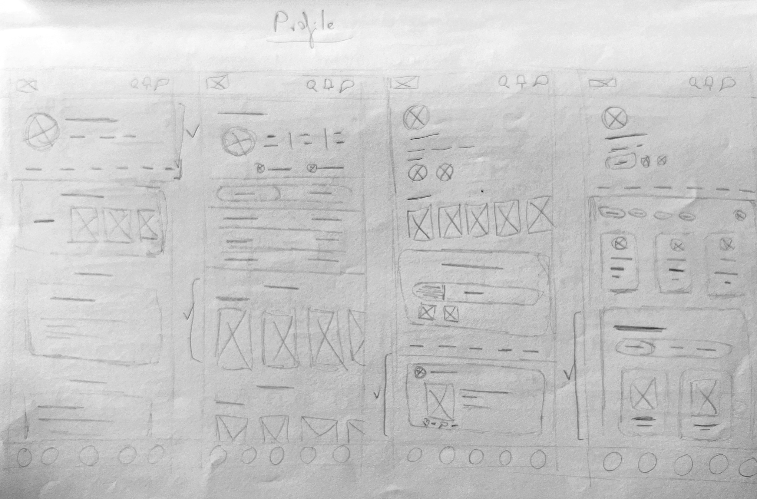
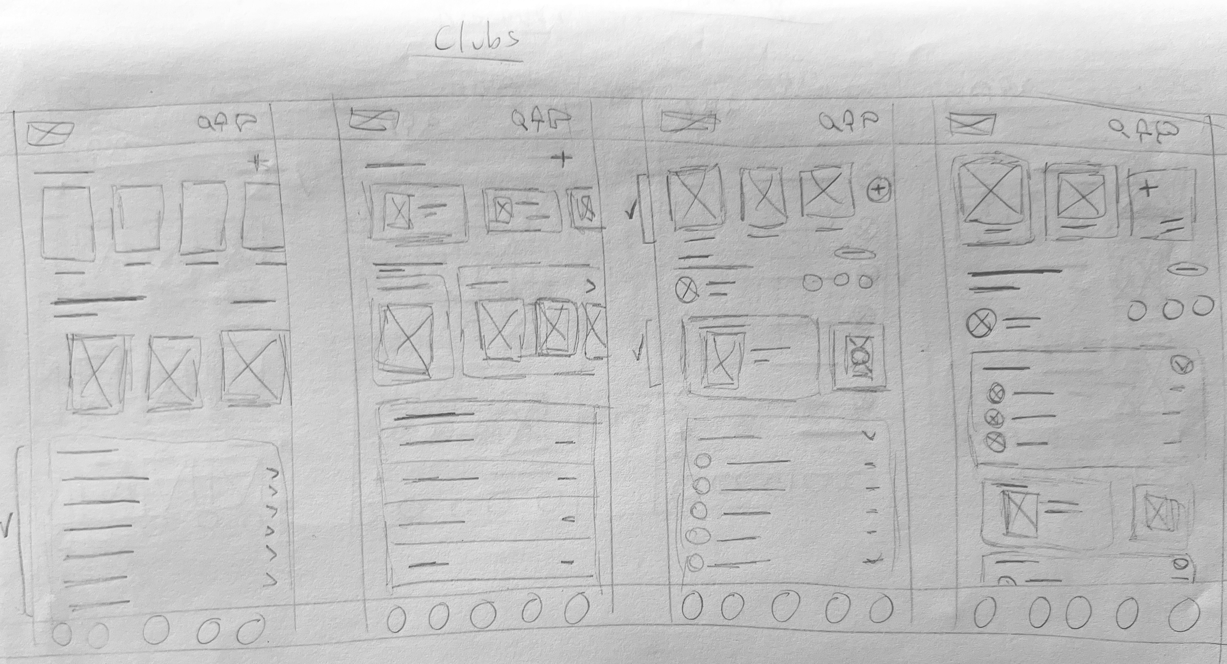
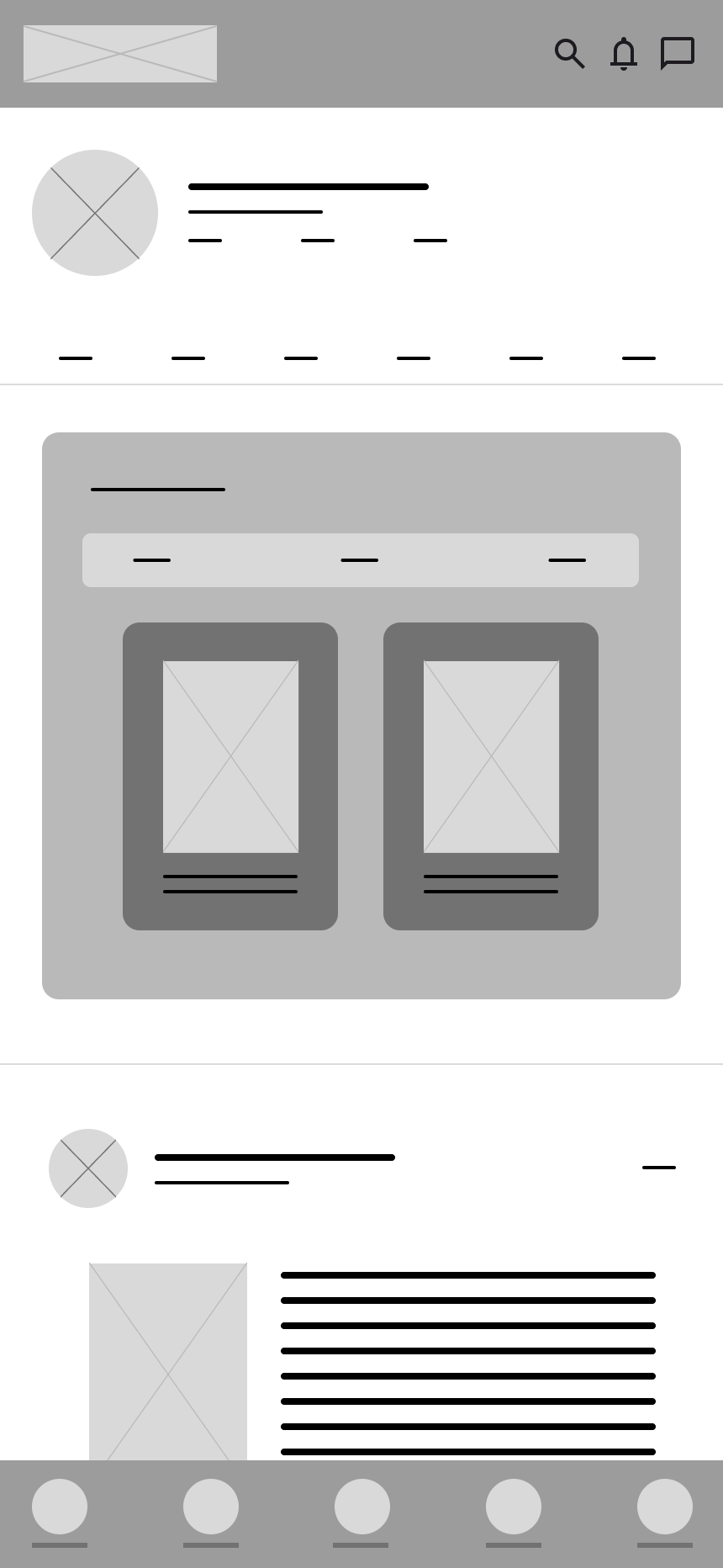
Paper wireframes
A first rough wiraframes were created to gather and test the indispensable functions and screens with users and make the necessary changes in the architecture of the app. The final layouts were digitalised into low quality wireframes.
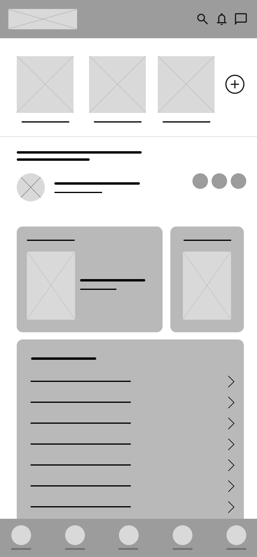
Digital wireframes
For the digital wireframes, the final aspect of the Interface was refined after a preliminary testing of the paper wireframes regarding usability flow and refined the new added functions.

New functions
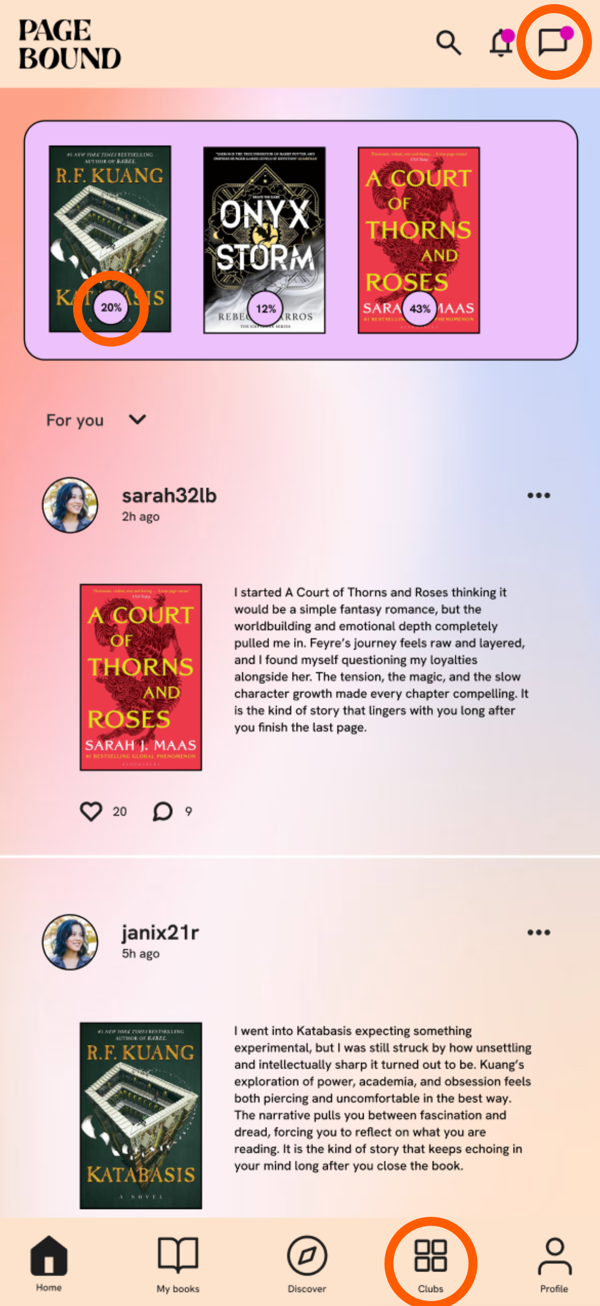
New chat between users function, allawing a new way to connect between readers.
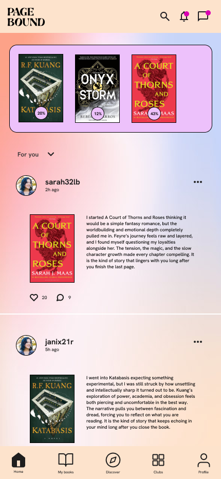
Simplified reading progress tracker allawing for an easier reading tracking experience.
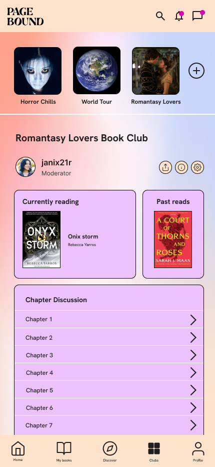
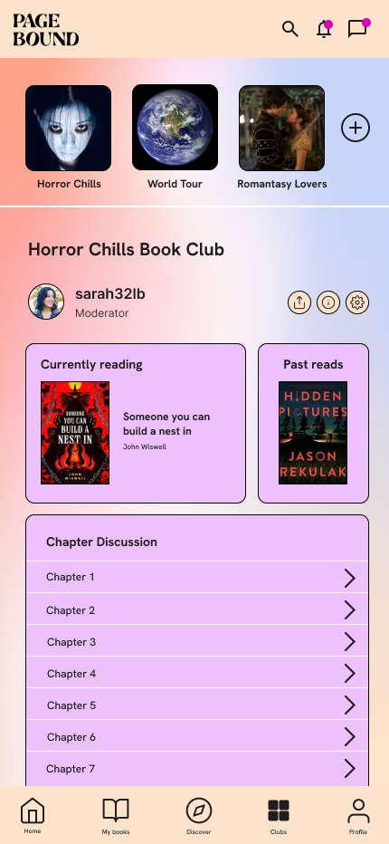
Book club page which help users easily connect over one common topic.
New functions
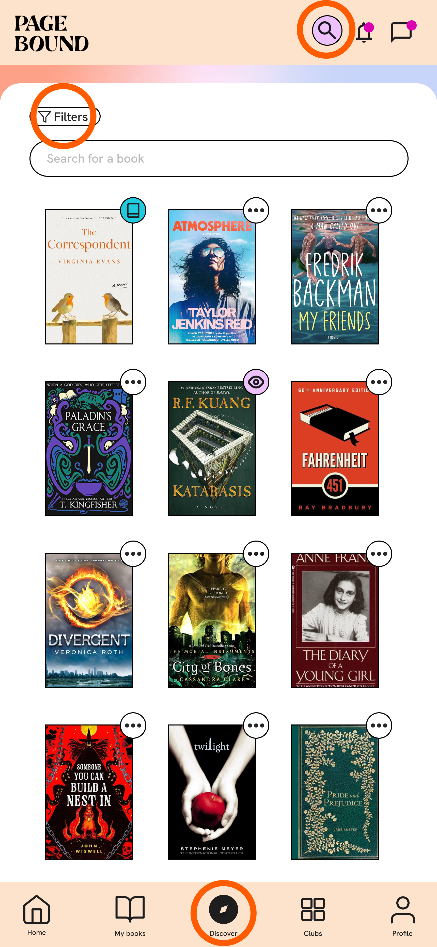
New search option always present allawing the search of new books.
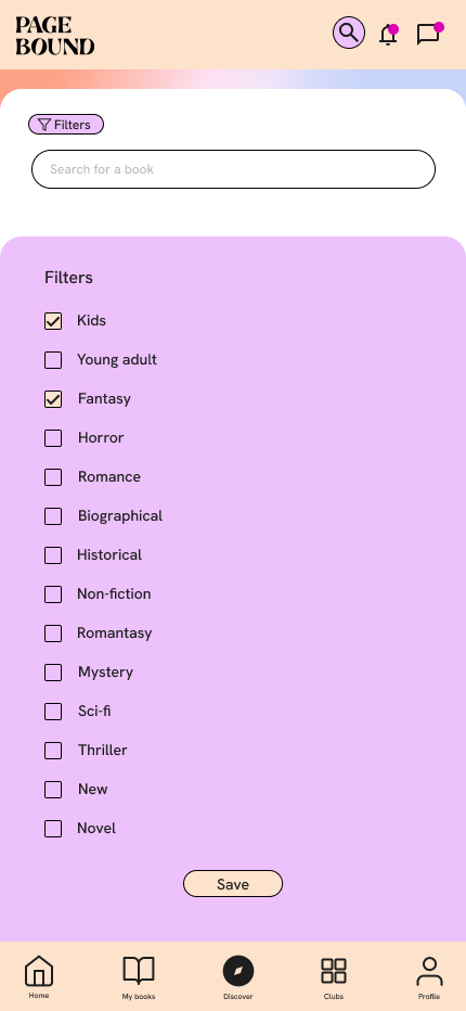
Filter function allowing to only see only books in the selected categories solving the pain point of seeing inappropriate books.
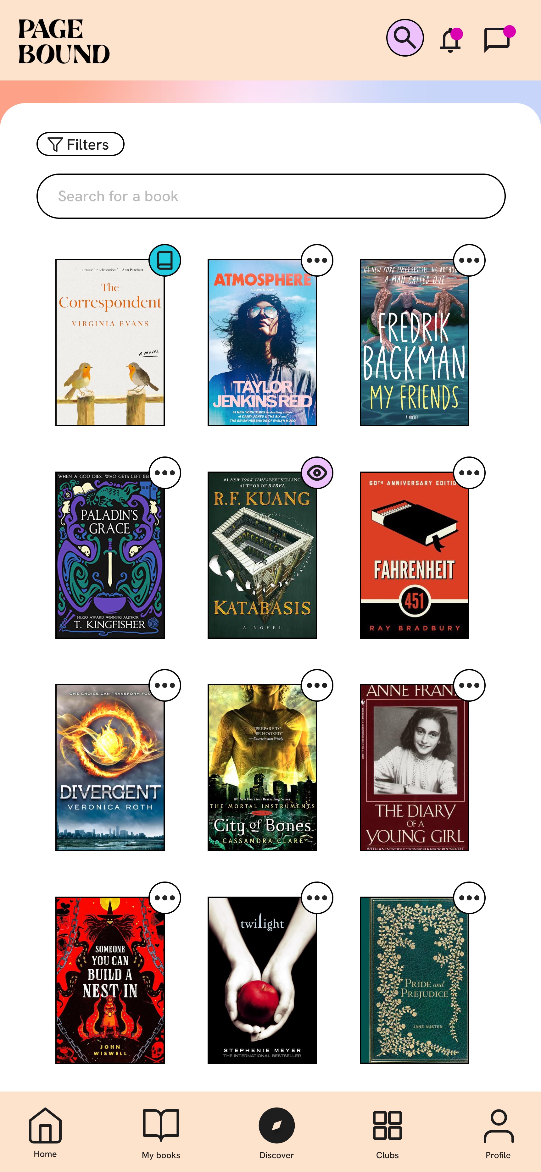
Discover page showing books grouped by different themes, allawing for the discovery of new and unexpected books.
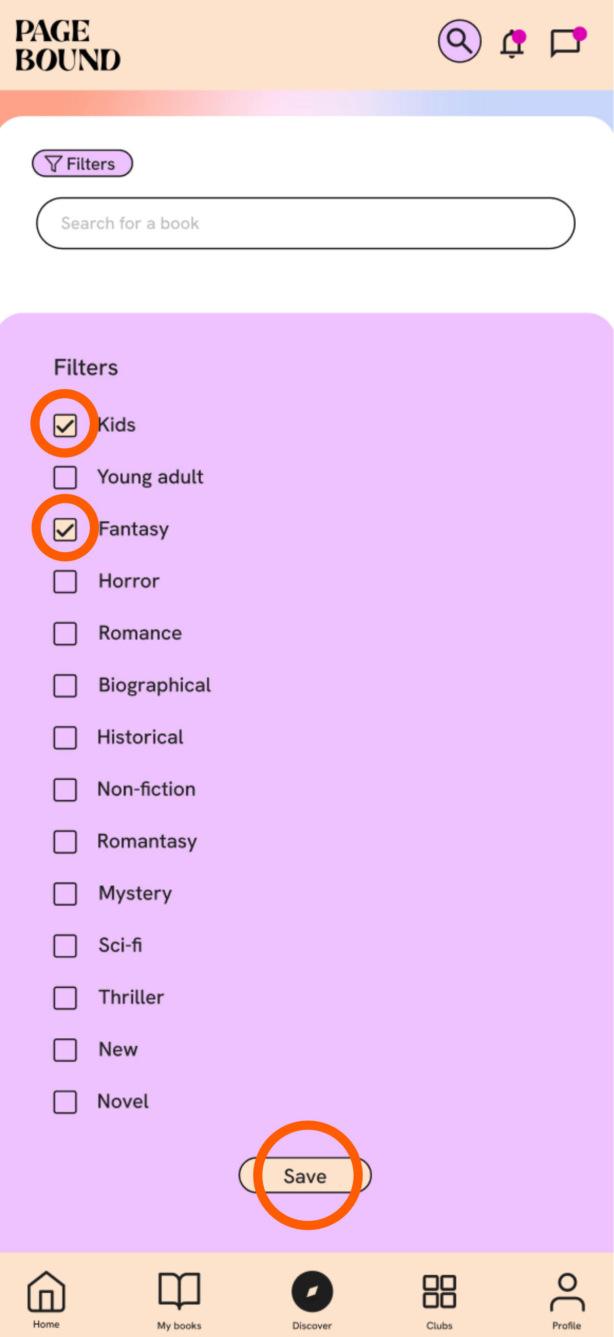
New functions
Multiple filter selection allawing to only show books that meed all the categories, solving the pain point of showing adult books while looking for kids books and also allawing for a more precise book search.
Save filter option keeping it active until you leave the screen to any other main page, not having to set the filter every time you check a book.
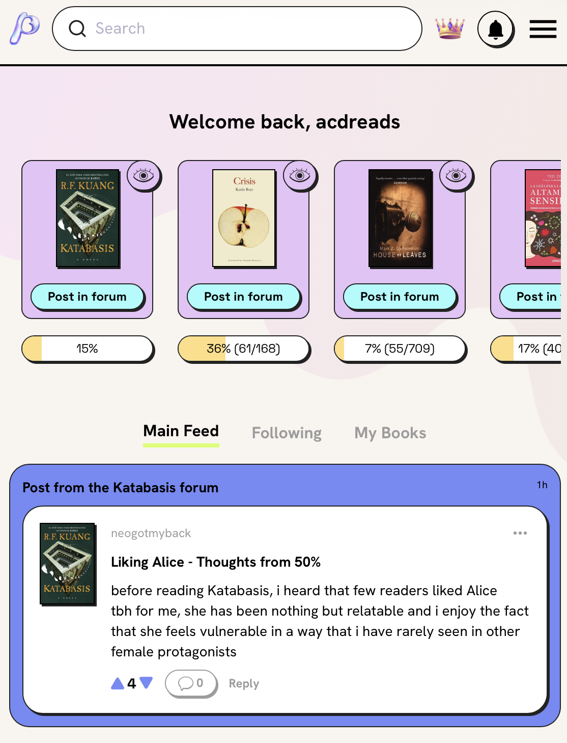
Final screens
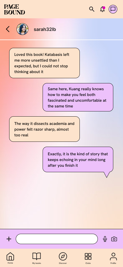
Chat
Filter
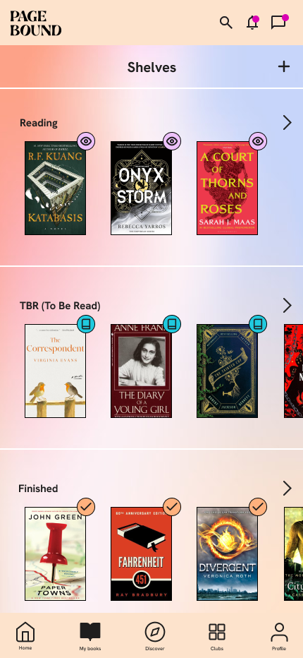
My books
Home screen
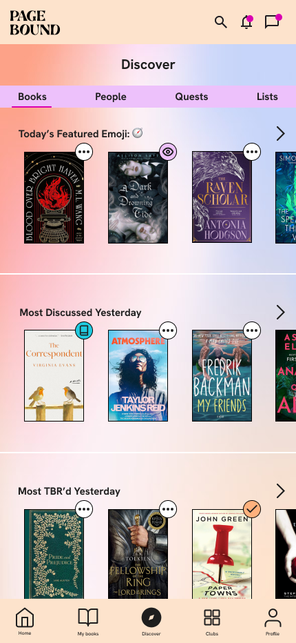
Discover
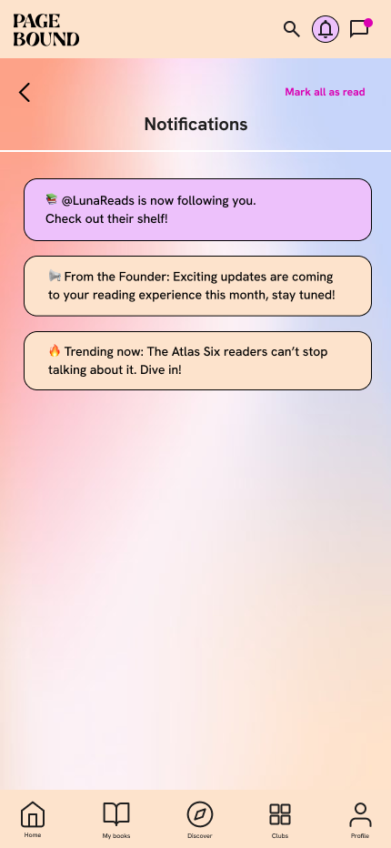
Notificaitons
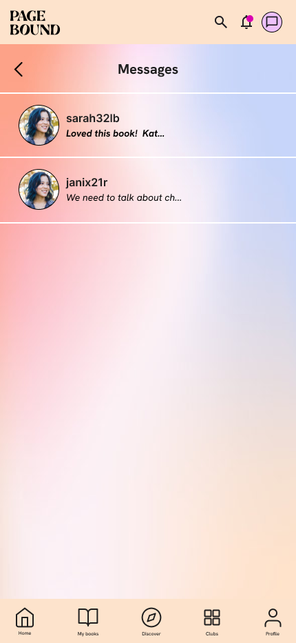
Messages
Club horror
Club romantasy
Search
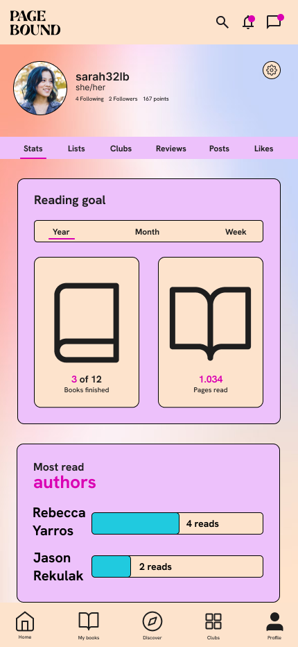
Profile
Accesibility considerations
The contrast between the text and background and, between sections has been increased to ensure that users with visual impairments would have a greater experience.
A clear delimitation between sections and elements was increased to ensure ease of navigations from users of all ages including senior users.
A title next to the icons and alternative text was added for visually impaired users since they also are an important part of the users thanks to audiobooks and text to speach tools.
Impact
The redesign significantly improved overall user experience and usability, while also introducing additional functionality with the multiple-filter search and a Chat section, enabling richer interaction between users that is not available on similar platforms.
Next steps
The next steps are the further developement of the book club function and explore the idea of taking the book clubs offline to increase the connection between users beyond reading books but creating a community.