


Romer
The project consist of creating a brand design, website and mobile app design to facilitate people's access to traditional remedies, and creation of promotional elements for the brand's social media.
The image of both products is intended to convey a friendly personality that is close to the user, conveying a sense of concern for their well-being. This will be complemented by simple but efficient operation and high-quality information.
The terms used to define it are: accessible, simple, warm and efficient.
The key message to be communicated is: ‘The importance and benefits of traditional remedies and their adaptation to new technologies’.
Target
The target audience consists of Spanish-speaking residents of Spain, with or without families, who are interested in improving their health or that of their loved ones, and who are interested in natural remedies and alternative medicine. People with adverse reactions to common medications.


Naming
For the creation of the name of the brand, an exhaustive study was done of different terms related to natural remedies, plants and traditional elements.
From all the combinations the one that was the easiest to recall while keeping the brand’s purpose and character was “Romer”.
The final name of the brand will be ‘Romer’ due to the use of rosemary in natural medicine and its widespread presence in traditional remedies for its antiseptic properties. The name has been used in Valencian as a reference to the brand's origin in Valencia and, as it is aimed at a Spanish-speaking audience, there is little difference between the word ‘romero’ in Spanish and ‘romer’ in Valencian , thus allowing for its understanding.
Typography
After analysing several type fonts, the one that aligns more with the brand’s warm and friendly character is “Nunito”
Specifically, it differs from other typefaces in its rounded finishes and the softer shape of its characters. This typeface also comes in a wide variety of weights, making it possible to use a single typeface for the entire brand.
Nunito
Aa Bb Cc Dd Ee Ff Gg Hh Ii Jj Kk Ll Mm Nn Oo Pp Qq Rr Ss Tt Uu Vv Ww Xx Yy Zz 0123456789Colours
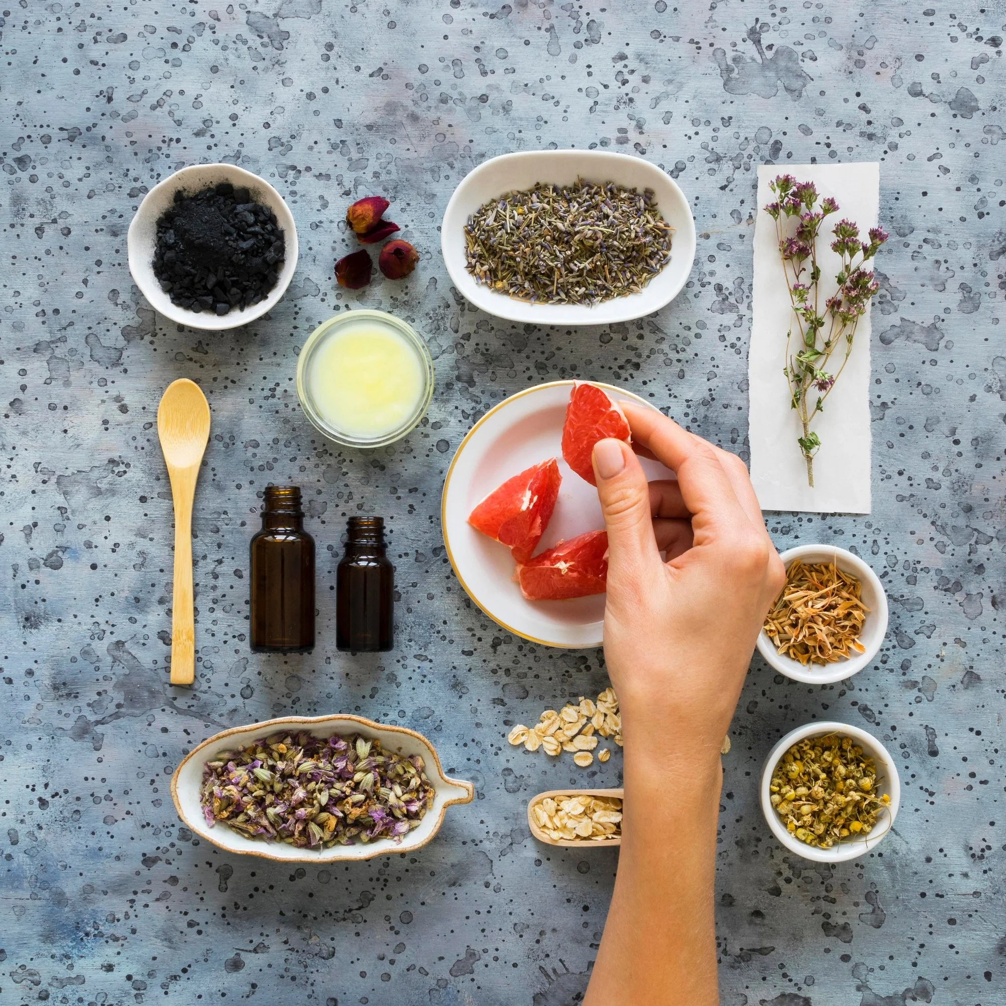
The selection of colours was created from a scientific illustration of the plant of the rosemary.
A shade of green and a shade of brown were chosen because, based on the concepts they symbolise, as previously observed in Eva Heller's book Psychology of Colour (2008, pp. 106, 107, 257), they are the ones that best fit the natural, calm and warm concept of the brand. These shades were chosen specifically because they are the most closely related to nature and warmth, as opposed to other shades that may be associated with other concepts. These two colours will be used with different saturation levels in all elements of the brand, together with black and white.
A shade of red was also chosen that would contrast and allow certain specific elements to stand out when used with the two main colours, while at the same time reinforcing the brand's concepts.
C 66
M 27
Y 66
K 10
R 95
G 139
B 102
#5f8b66
C 44
M 82
Y 86
K 70
R 74
G 29
B 5
#4A1D05
C 23
M 95
Y 80
K 18
R 167
G 38
B 44
#a7262c
Illustraitons
A series of illustrations have been created for use on the website and in the app to represent both the remedies and the plants in a more iconic way, ensuring they are recognisable in small sizes, remain faithful to the brand's style, and provide cohesion between the elements.

Logo creation

Sketches were made for logos divided into three categories: a typographic one based on the initial of the brand name, an iconic one based on the image or icon of rosemary, and an abstract one based on a representation of rosemary or its elements in the form of patterns or non-iconic representations.
To create the logo, a sans serif typeface, NRT, was modified, given rounded ends and altered in size to give it a more approachable and human character.

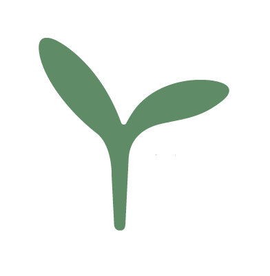
The final icon to be used as the brand logo is typographic due to the combination of the initial ‘r’ of the brand and its resemblance to a sprout or plant, thus having a deeper meaning in relation to the company's activities.
When creating the final logo, different compositions were tested with the brand name and different text box sizes, as well as their combination.
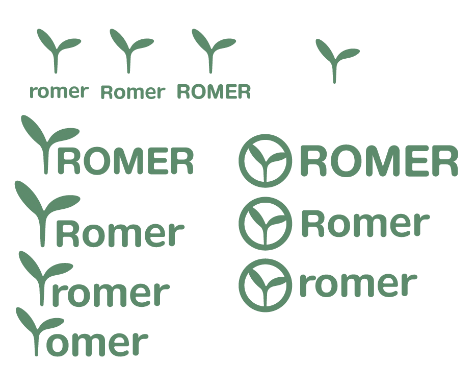
Final logo
The final logo chosen was the version with the icon followed by the brand name, as this composition is very stable because both the logo and the text share the same base. It also alludes to the sprout formed by the icon germinating in the earth, thus emphasising natural and minimally processed products.

Website and app
For the creation of the website and mobile app a study with user journey maps, flow diagrams and information architecture to better understand the users and adapt to their needs.
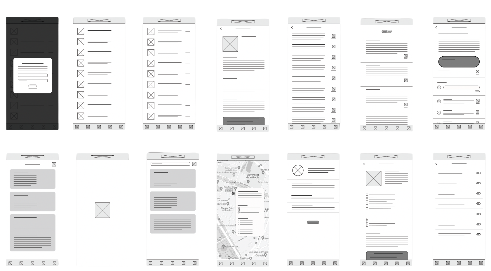
Based on the initial sketches, wireframes were created to serve as a guide for the creation of the final screen design.
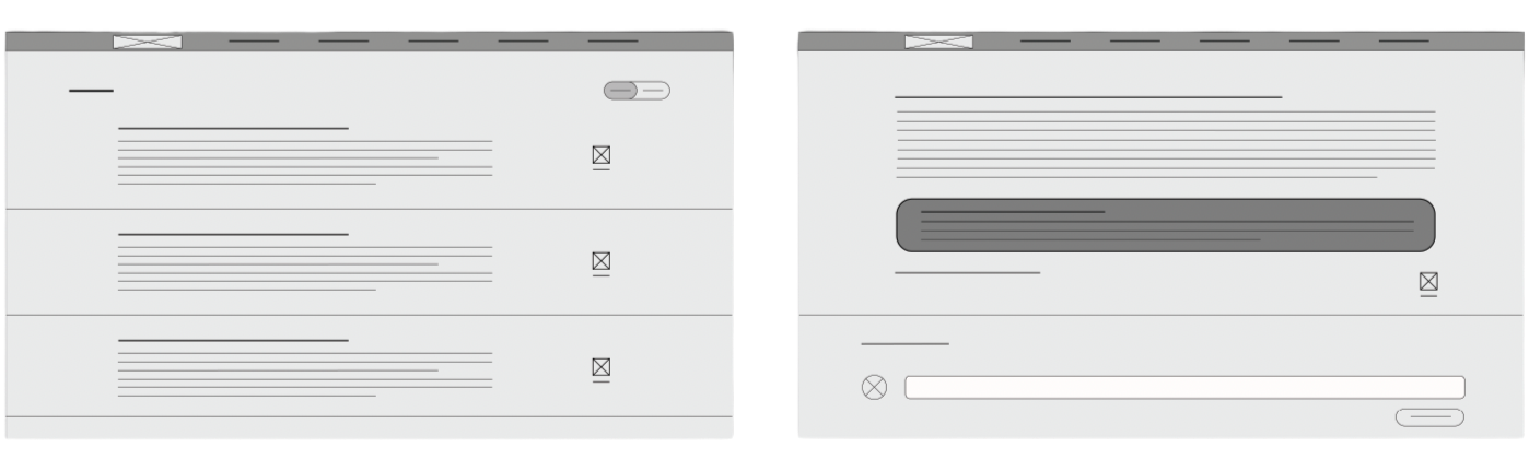
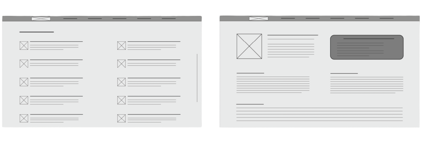
Website

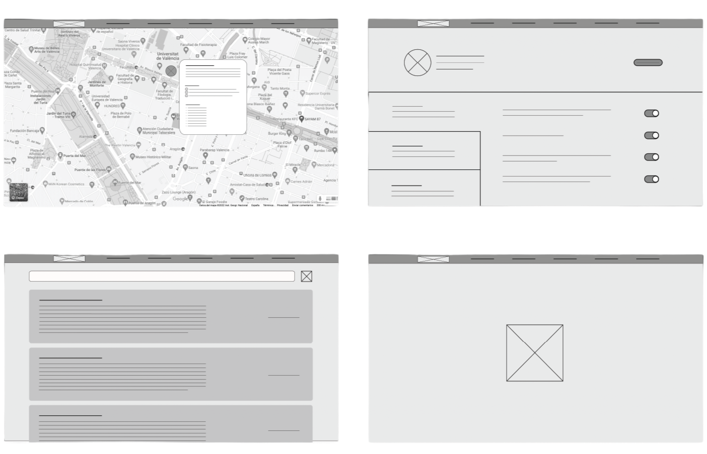
App
Icons

For the mobile application menu, a series of icons were created and adjusted to be closely related to the screen or category they represent without the need for text.
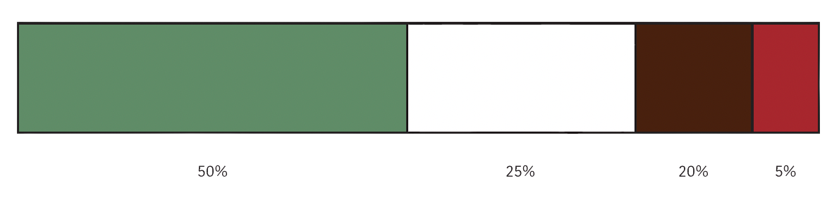
Colours
Both the application and the website will use the following colours in these proportions to maintain visual hierarchy.
Final screens
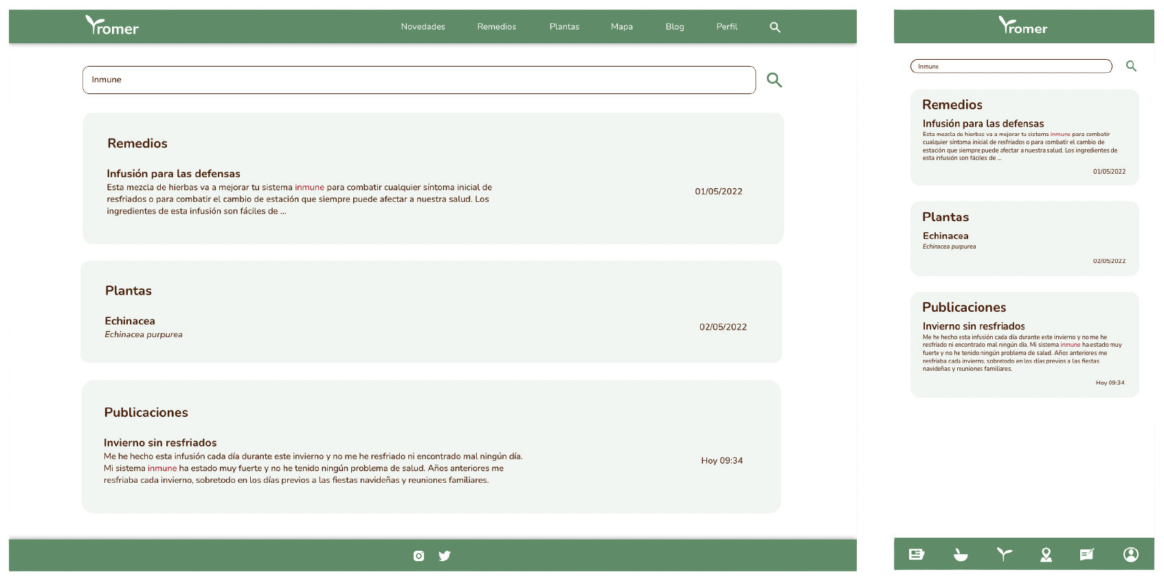
The final screens for the website and their mobile app variation where created based on all the previous research and simple wireframes.

Home
News
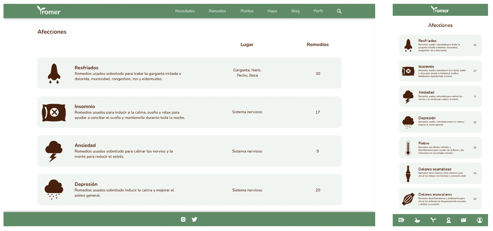
Illnesses
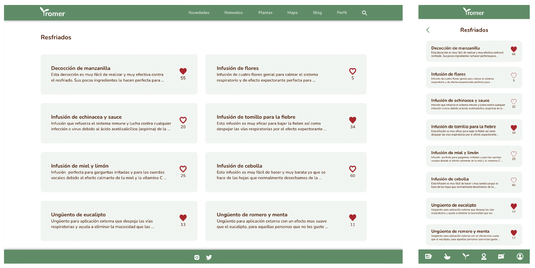
Remedies
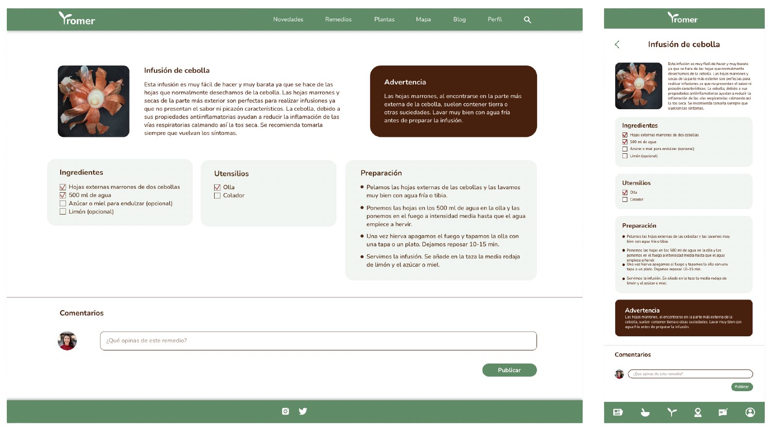
Remedy
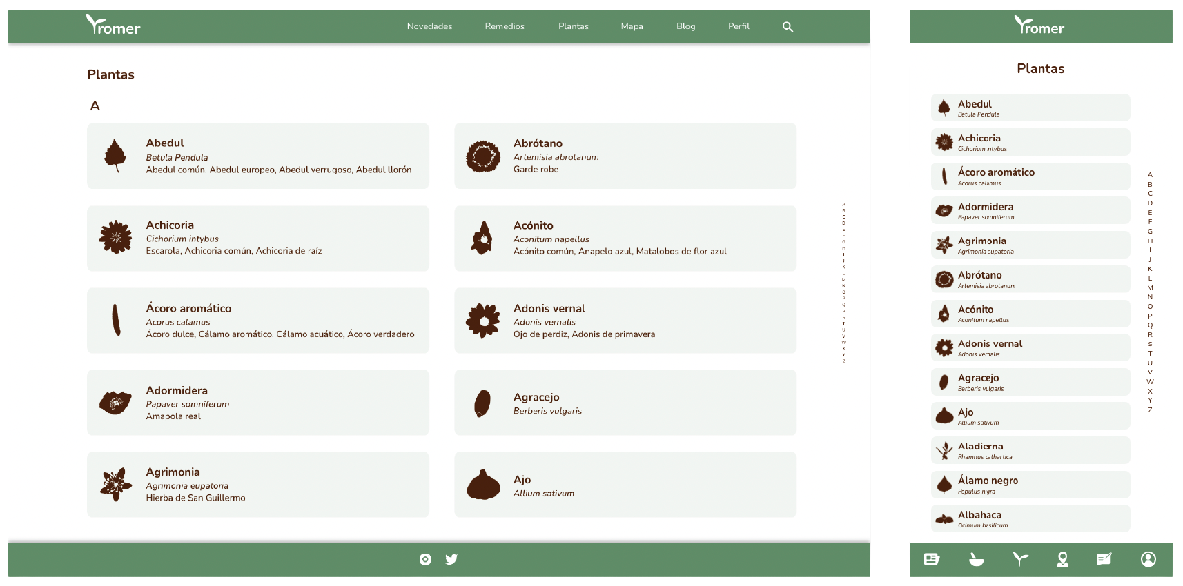
Plants
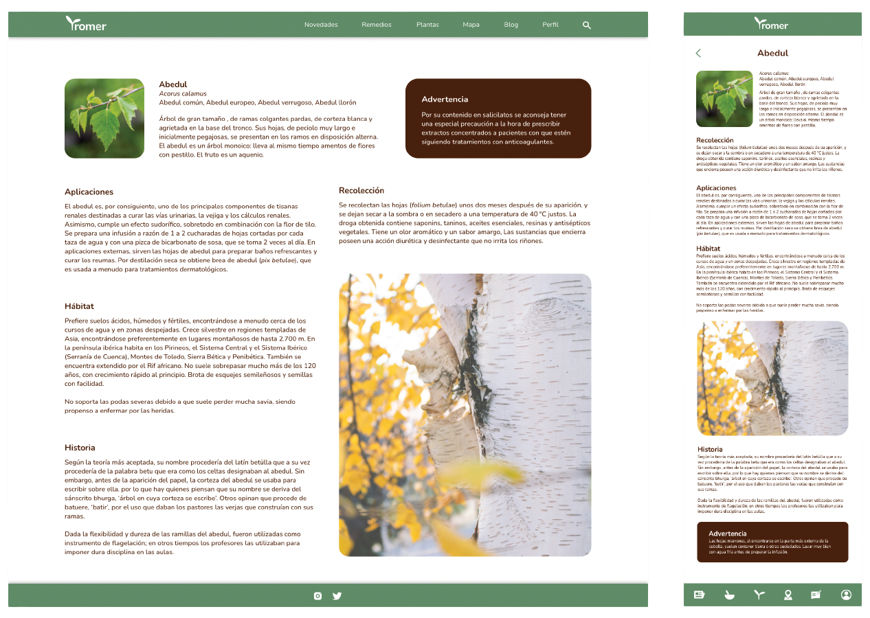
Plant
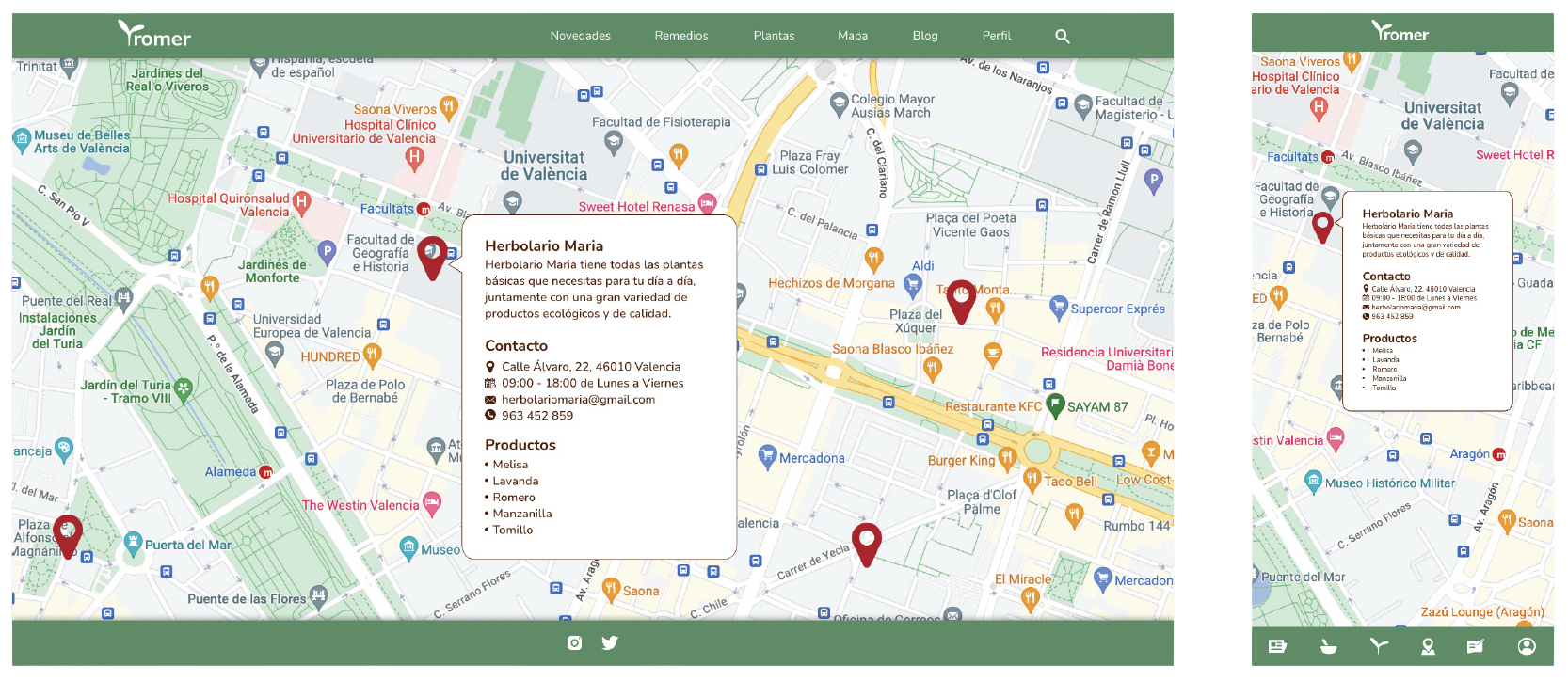
Map
Blog
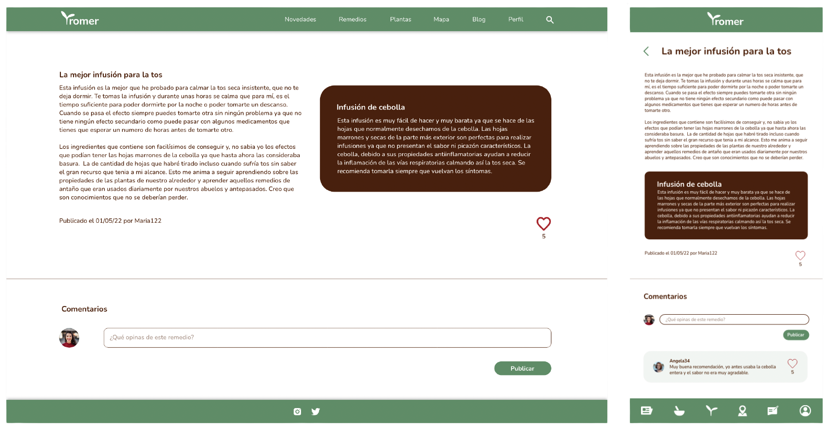
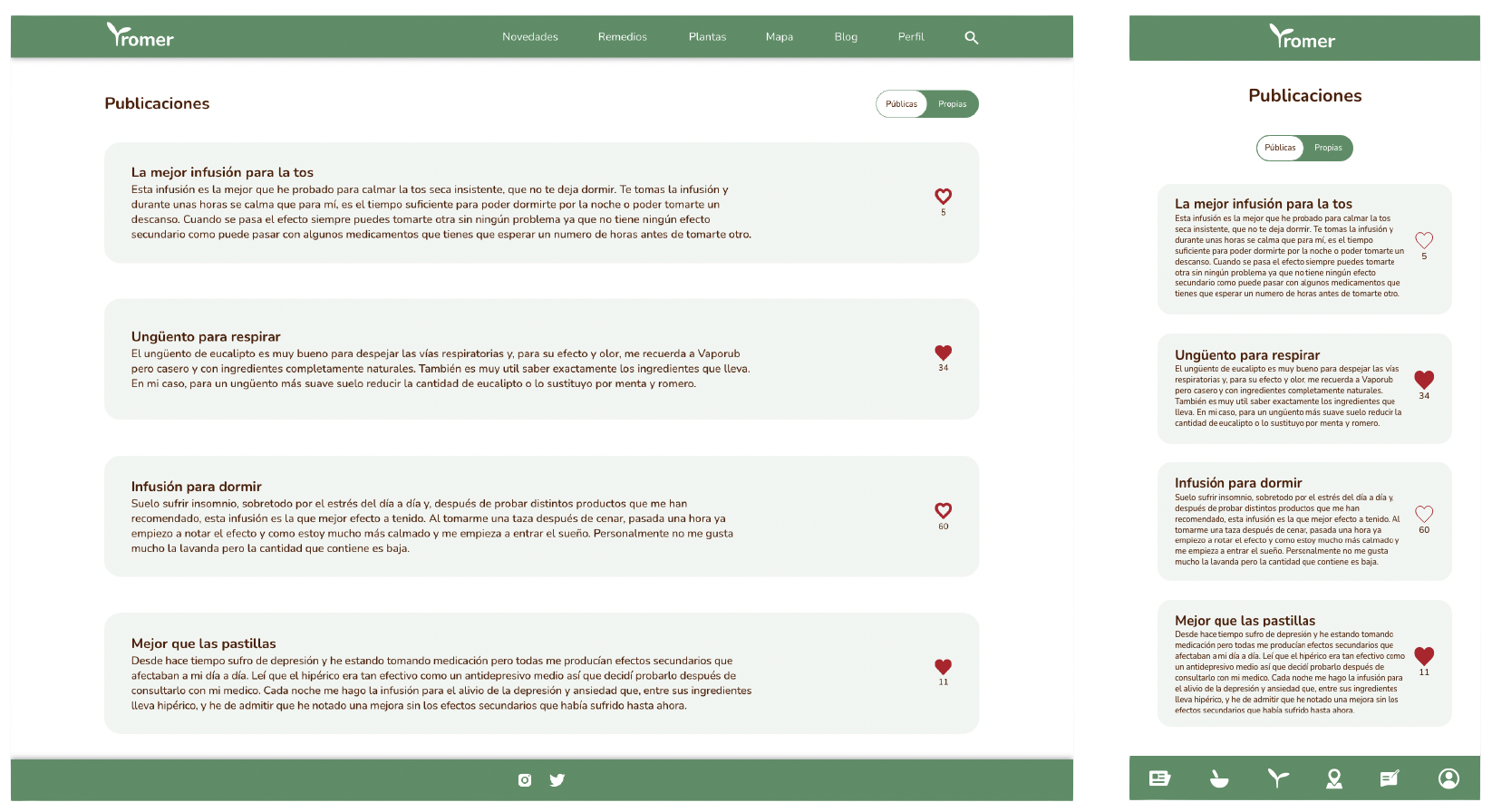
Post
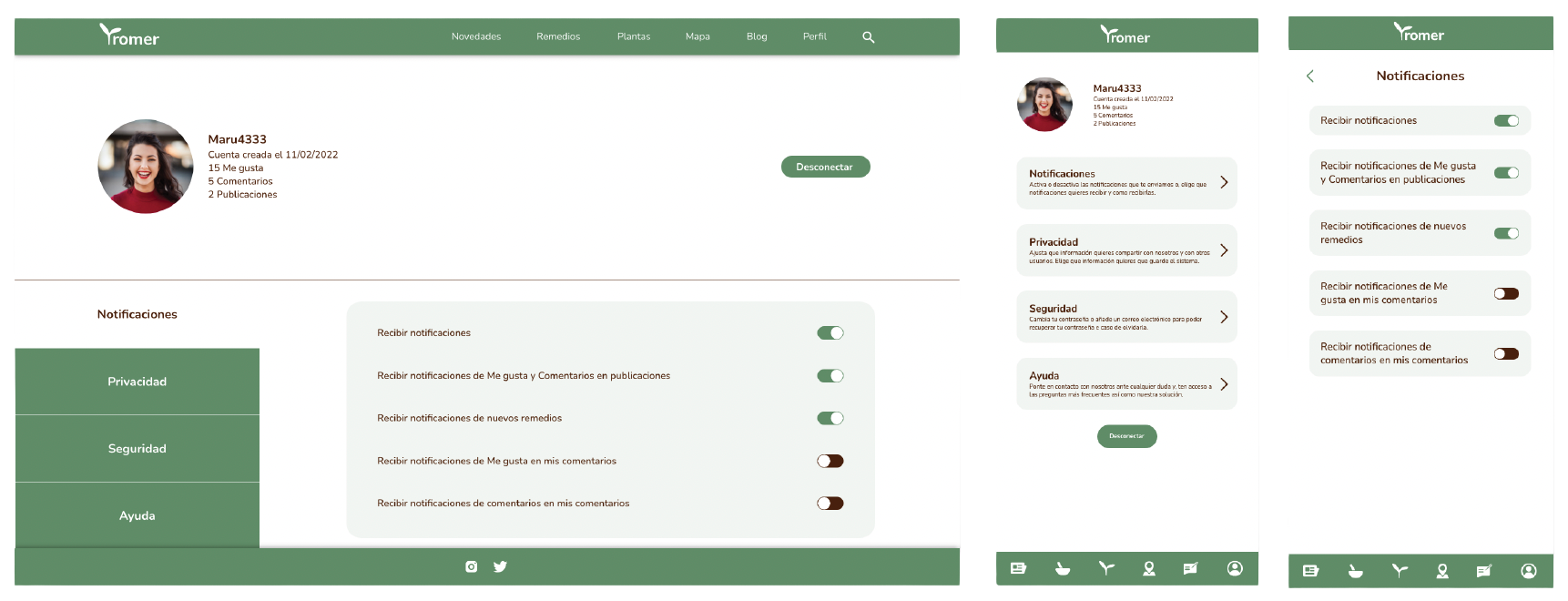
Profile
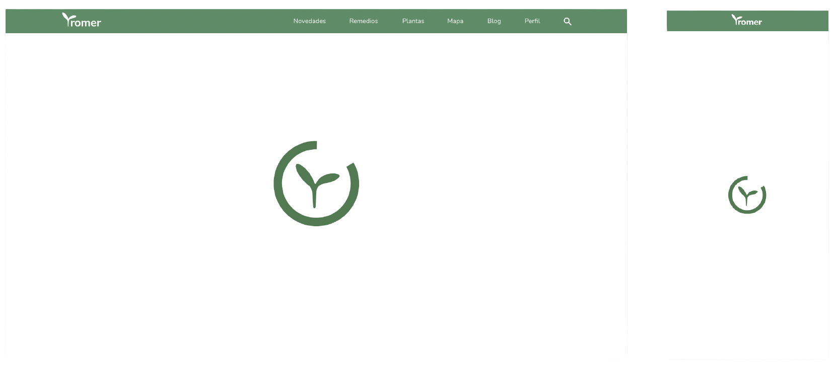
Loading page
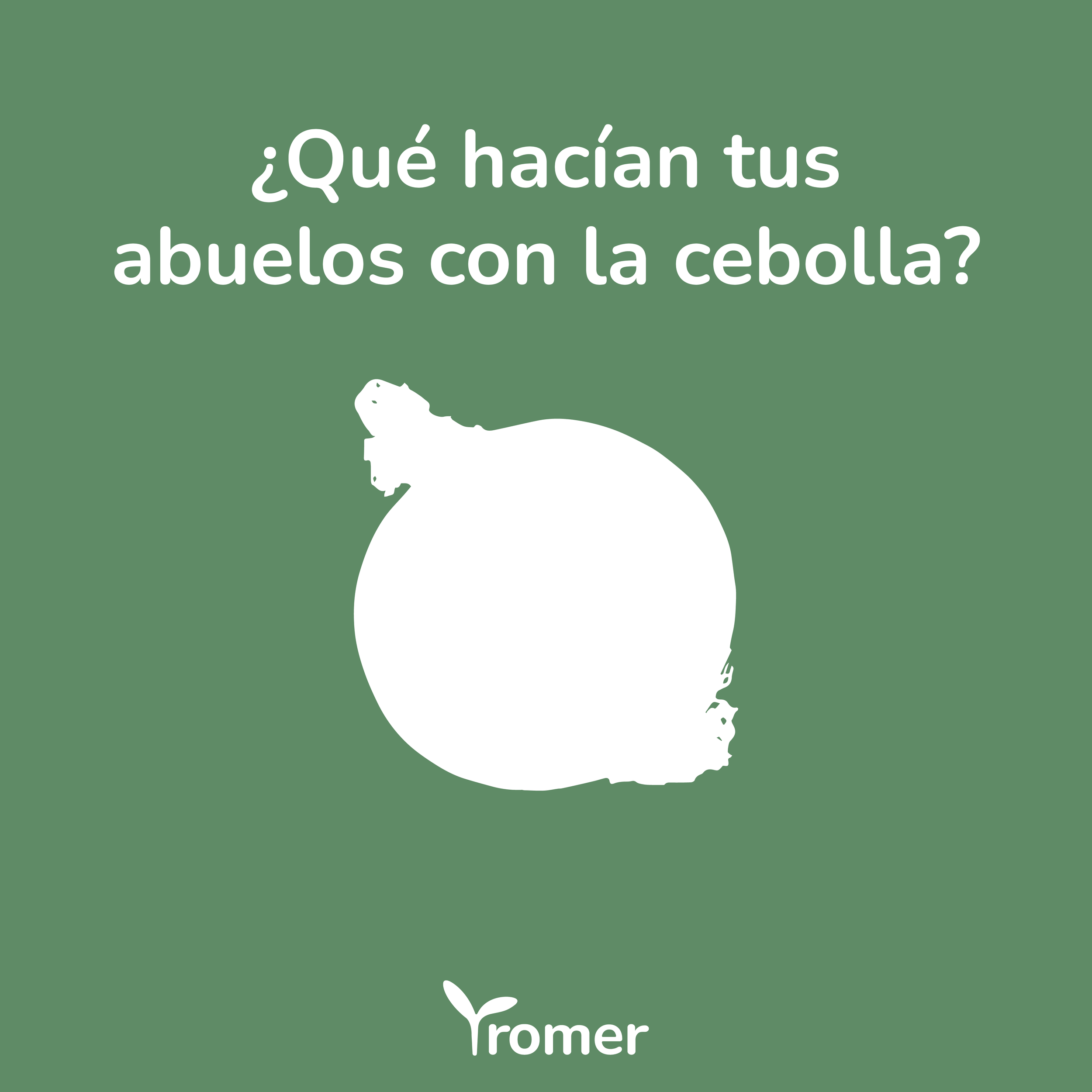
Social media posts
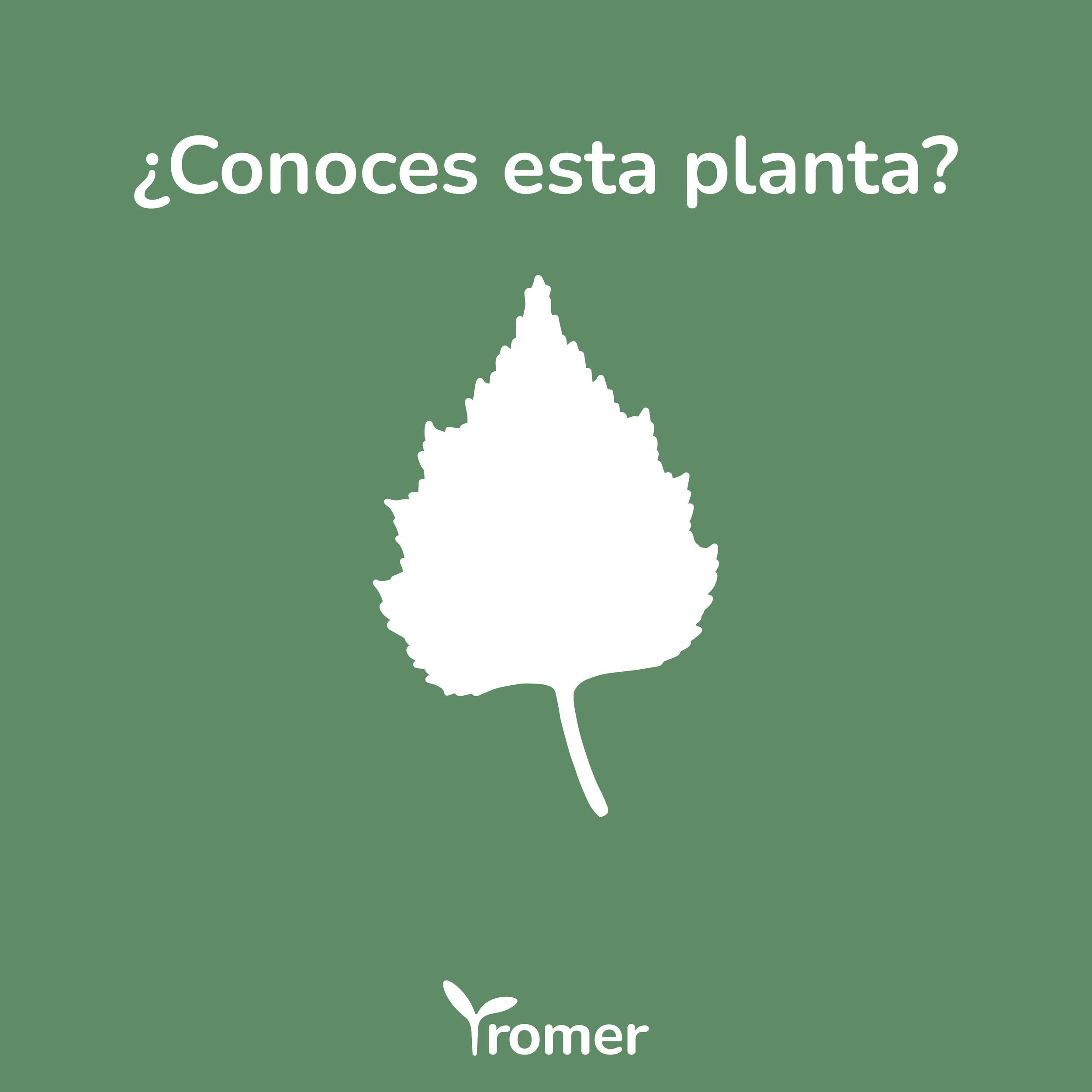
A series of Instagram posts were created to promote the brand and product before the launch, to get the users exited and curious.
Business card

As a new brand, a business card was created to give people a way of contact representatives and send their ideas or contribute to the development of the project.
With the final design we achieved a warm and accessible branding while also creating an intuitive and approachable website and app, setting the project apart from the direct competitors and making it accessible to the users.